Feb 26, 2024
It took nearly two years to design hundreds of characters for Across the Spider-Verse.
"Spider-Man: Across the Spider-Verse" was one of last year's biggest talking points, animated or not, and was nominated for an Academy Award for Best Animated Feature.
Critics and audiences hailed it as a major step forward for the Oscar-winning franchise, both narratively and aesthetically.
One of the standout virtues of Spidey's sequel is the film's excellent cast of Spider characters. Curious about the design process required to create such a broad and diverse cast, we spoke with two of the film's character designers, Kris Anka and Jesús Alonso Iglesias, about their involvement in the production and the origins of the film's impressive spiders.
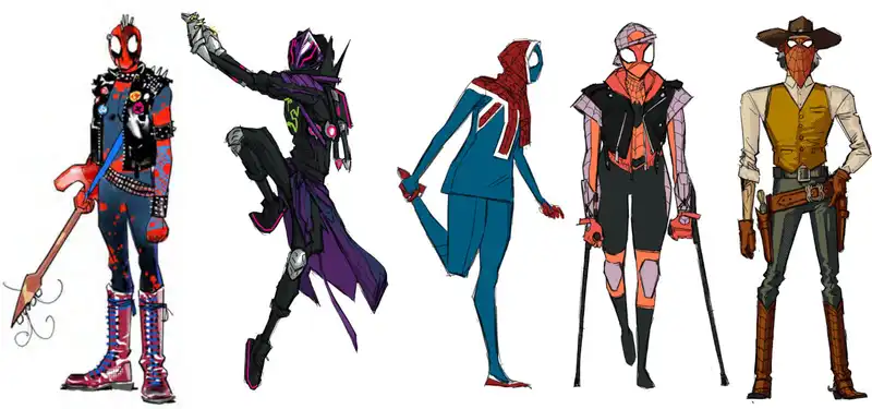
They also provided us with designs showing how the characters evolved throughout the production process.
Kris Anka: For ease of distinction, we will refer to the Prowlers as "Wiles". We called him that internally for years to clarify when we needed to distinguish between Miles, the hero of Earth 1610, and Miles, the alternate dimension of Earth 42. When designing Miles, we asked, "What is the status of his world?" I asked. He was not originally intended to be a prowler. We had to decide what this kid would be like without power. How would he build his personality to do what he needed to do to survive in this world?
The challenge from there was to integrate the iconography of the prowler from the first film and reinvent it in a way that would work for young children. It needed to feel handmade, not super-manufactured. We worked on creating a silhouette that would immediately make you say, "Oh, this is a prowler." But when he gets closer to the camera, you get a whole different vibe.
So when you first see Wiles, he has longer lines and a lot more drape. There are still features that immediately identify him as a prowler, but as he gets closer, you realize that there is a different style here, and as the elements unravel, you realize that it is Miles in this universe.
The design of Miles was a really fun collaboration between myself and Even Monteiro. We were in perfect breath about the character from the beginning, and I think we spent probably a year and a half, almost two years, fine-tuning Wiles.
Spider came from a variety of sources. We got instructions like, "Chris, we need to fill this room. The first step was to pull what we could from comics. Some spiders, like Web Slinger the Cowboy, were wanted by everyone from the beginning. The same was true of Spider Bite. We also did designs for characters in Spider-Man Unlimited and The Spectacular Spider-Man, and anything else that fans thought would be cool to see in a movie. And during production, anytime someone came up with an idea for Spider, we asked them to submit it. But we still needed more spiders, and in the end we made about 100 spiders.
Jesús Alonso Iglesias: For Spider Punk, the first designs we did were based on classic London punks: suspenders, the fabric they used, the big boots, the T-shirts they wore. The designs we did in the early days of the film helped us to develop the characters later on.
Even Monteiro, he was the one who finally solved his look. It was based on different people from punk rock culture. Once I had a face, things became easier. I had my initial design, which I put together with the face, and then it was just a matter of finding the final proportions, graphic techniques, and solutions for the character.
I worked closely with the artists Omar Smith and Joe Mosier (character designer) who created the 3D models. We worked together for several days, doing drawovers based on the 3D sculpture Omar sent us, to find the final exact proportions for the length of the limbs, the boots, the slenderness, etc. That sort of thing.
Another problem was the hair, and how it would fit under the mask. In the end, this wasn't a problem because this is an animation. No one had to worry about what would happen to his hair when he put on the mask.
Alonso Iglesias Vulture was the first character I designed. From the very beginning, this character was very cool. It was not the classic Vulture we were discussing at the time, but was influenced by Leonardo da Vinci. It required a completely different technique, with cross-hatching and sepia coloring. Everything I came up with in my head looked really cool, but to be honest, I eventually had to stop working on this character. I was mentally and creatively blocked and could not move forward with this character. I couldn't sleep, I couldn't focus on anything else. I told the directors, "Enough. I had to say, "I cannot continue with this character.
So the directors turned over what I had done to Mauro Belfiore, and he did everything we wanted to do with the character in the first moment. I was amazed at how easily he was able to do things that I never could have done. The result was incredible, and their way of animating brought something special out of the character that I would never have been able to do.
It's not often in my career, but it was great to know that when you fail and can't find a solution, you have a great team of artists to support you and help you get back to what you left undone. I am very happy with the end result. I think Vulture is one of the most beautiful characters in the film.
.


Post your comment