Apr 24, 2022
Avoid 6 common mix-ups to improve your animation
Cartoon Brew's popular YouTube star Toniko Pantoja released a new video this week.
In the 12-minute video, Pantoja, an experienced industry professional, outlines six common mistakes and misconceptions of animators, both amateur and professional. He also gives specific examples and offers explanations and solutions to avoid future confusion.
Pantoja became aware of these common misconceptions when he made a video in which he studied and copied frames from live-action video. People thought I was using rotoscoping," he recalls. But that was not the case; Pantoja was not drawing over or tracing existing live-action footage, but drawing frames from scratch, using the original footage as a reference. He argues that it is unfair to animators to think that they must rotoscope their hyper-realistic motion animation.
The principles of solid drawing, or draftsmanship as Pantoja calls it, include not only the technical and structural aspects of drawing, but also the constructive aspects such as straight and curved lines, asymmetry, and line thickness. Pantoja argues that all of these concepts belong to solid drawing and not appeal. He also expresses distaste for the term "appeal" as inherently biased. For many people, appeal refers to something visually pleasing. Appeal is the charisma of the picture, the personality of the picture. In other words, something drawn ugly, creepy, or offensive is appealing even if it is not pretty.
Pantoja rejects the misconception that increasing the number of frames will always make the animation smoother and the work more valuable. He argues that with the right spacing, things will certainly move more smoothly, but going too far can create something that feels "too floaty because things are always moving and sliding into certain poses." Sometimes, he argues, a scene composed of well-spaced drawings, even with a limited number of frames, can be more powerful, and advocates holding certain frames longer for greater impact.
Timing refers to the length of time spent on an action or moment, while spacing refers to the distance between frames. According to Pantoja, timing is the rhythm of the scene and has nothing to do with spacing or the picture itself. Rather, it refers to the time it takes to develop each idea on the screen.
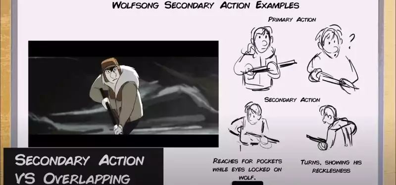
Pantoja's frustration peaks when discussing secondary action versus overlapping. Overlapping refers to follow-through where one part of an object, such as a hair, a piece of cloth, or a body part, begins to move or fall over while the rest of the object continues in a later frame. So what is secondary action? Pantoja's simple explanation goes like this: "It is a layer on top of the primary action. In his example, he uses a pair of walking legs to show how small details and nuances can be used to indicate how a character is feeling: jovial, normal, stern, etc. It energizes the footsteps of the characters.
Pantoja argues that more squash is not always the right way to add weight to an object. Other effective means of showing weight include timing adjustments, overlapping actions, spacing, slow ins and outs, and overall drawing. He also refutes criticism of squash and stretching as too cartoonish or distracting, explaining that even in hyperrealistic animation, squash and stretching can be used to add weight in more subtle ways
.


Post your comment